1
2
3
4
5
6
7
8
9
10
11
12
13
14
15
16
17
18
19
20
21
22
23
24
25
26
27
28
29
30
31
32
33
34
35
36
37
38
39
40
41
42
43
44
45
46
47
48
49
50
51
52
53
54
55
56
57
58
59
60
61
62
63
64
65
66
67
68
69
70
71
72
73
74
75
76
77
78
79
80
81
82
83
84
85
86
87
88
89
90
91
92
93
94
95
96
97
98
99
100
101
102
103
104
105
106
107
108
109
110
111
112
113
114
115
116
117
118
119
120
|
import pandas as pd
import numpy as np
from clearn.data_preprocessing import *
import matplotlib.pyplot as plt
import matplotlib.patches as mpatches
from matplotlib import font_manager
plt.rcParams['font.family'] = 'Times New Roman'
plt.rcParams['axes.unicode_minus'] = False
if __name__ == '__main__':
import os
wkdir = 'C:/Users/Admins/Desktop'
os.chdir(wkdir)
path = 'Z:/TData/big-data/sad41d8cd/251106_Data_Missingness_Overview_Chart.csv'
df = pd.read_csv(path, index_col = 0)
if True:
df.head()
df.columns
df.info()
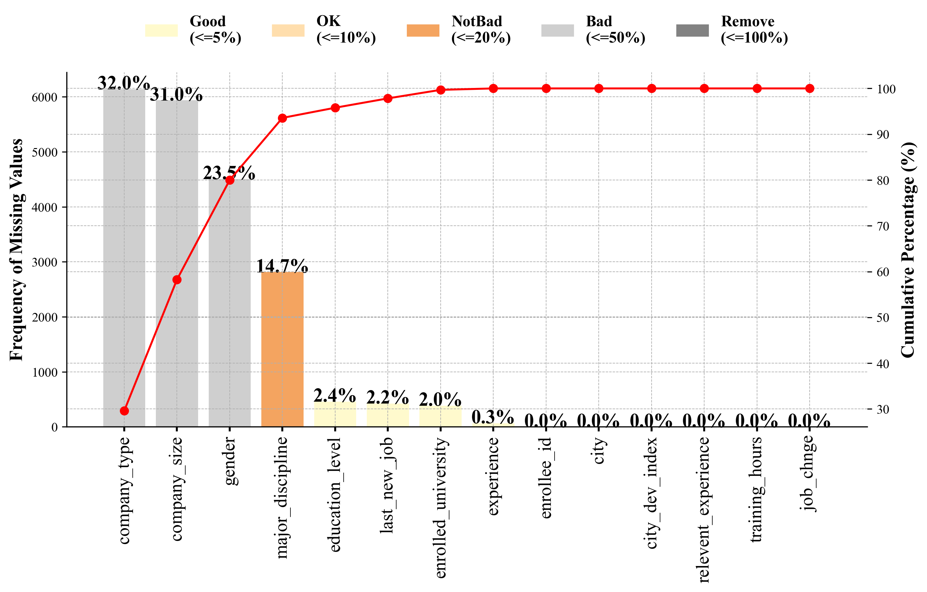
compute_missing(df, normalize = True)
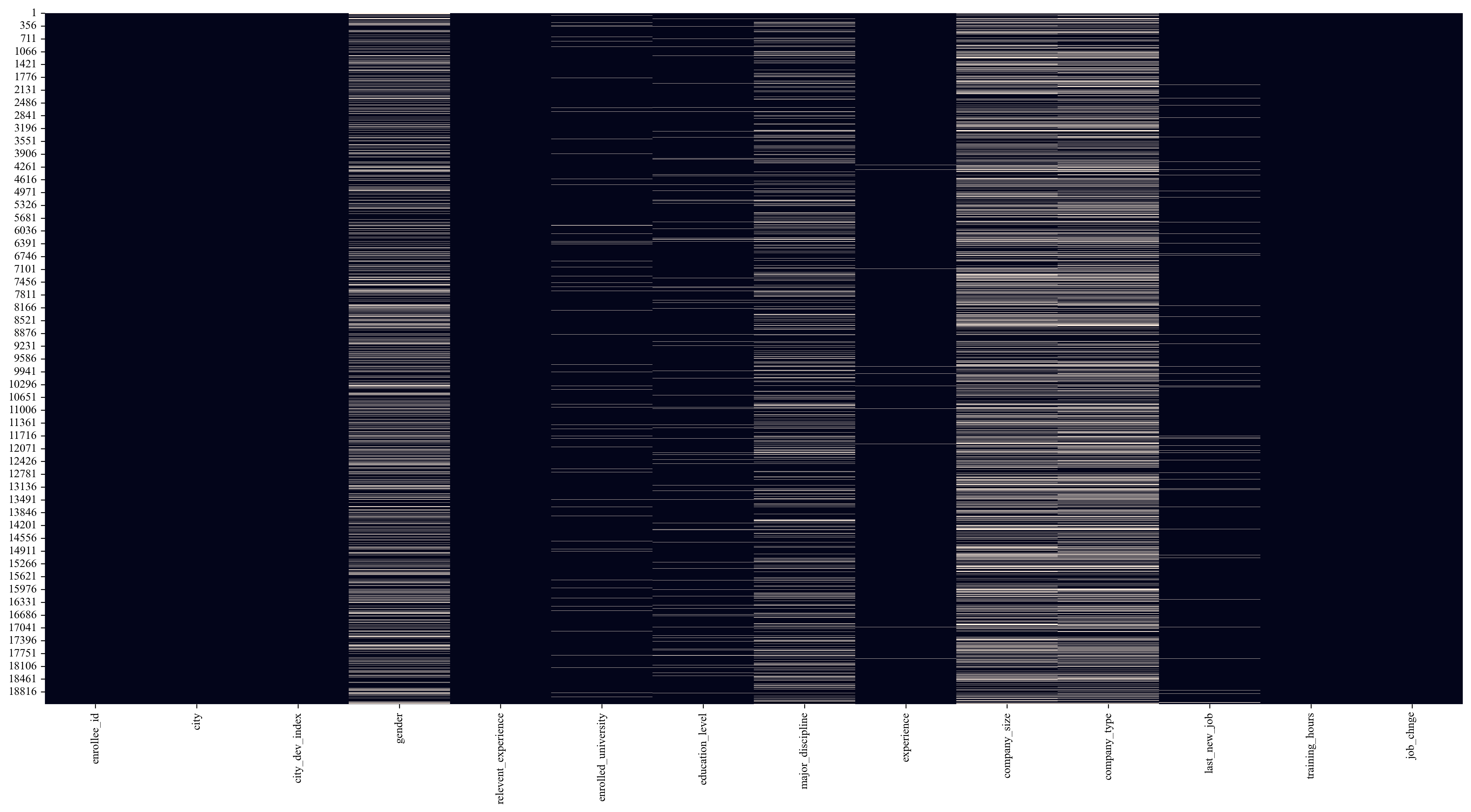
missing_values_heatmap(df, output_path = None, savefig_kws = None)
plt.savefig("heatmap.png", bbox_inches = 'tight', dpi = 300)
missing_counts = df.isnull().sum()
missing_percentage = (missing_counts / len(df)) * 100
missing_data_df = pd.DataFrame({
'Feature': missing_counts.index,
'Missing Count': missing_counts,
'Missing Percentage (%)': missing_percentage.round(1)
})
missing_data_df = missing_data_df.sort_values(by='Missing Percentage (%)', ascending = False)
missing_data_df['Cumulative Percentage'] = (missing_data_df['Missing Count'] / missing_data_df['Missing Count'].sum()).cumsum() * 100
if True:
def get_color(percentage):
if percentage <= 5:
return '#FFFACD', 'Good (<=5%)'
elif percentage <= 10:
return '#FFDEAD', 'OK (<=10%)'
elif percentage <= 20:
return '#F4A460', 'NotBad (<=20%)'
elif percentage <= 50:
return '#CFCFCF', 'Bad (<=50%)'
else:
return '#828282', 'Remove (<=100%)'
fig, ax1 = plt.subplots(figsize = (11, 5))
bars = []
for i, perc in enumerate(missing_data_df['Missing Percentage (%)']):
color, label = get_color(perc)
bar = ax1.bar(missing_data_df['Feature'][i], missing_data_df['Missing Count'][i], color = color, label = label if i == 0 else "")
bars.append(bar)
ax1.set_ylabel('Frequency of Missing Values', fontsize = 14, fontweight = 'bold')
ax1.tick_params(axis = 'x', rotation = 90, labelsize = 14, width = 1.5)
ax1.grid(True, which = 'both', linestyle = '--', linewidth = 0.5)
for i, bar in enumerate(bars):
height = bar[0].get_height()
perc = missing_data_df['Missing Percentage (%)'][i]
ax1.text(bar[0].get_x() + bar[0].get_width() / 2, height + 1.8, f'{perc}%', ha = 'center', fontsize = 15, fontweight = 'bold', color = 'black')
ax2 = ax1.twinx()
ax2.plot(missing_data_df['Feature'], missing_data_df['Cumulative Percentage'], color = 'r', marker = 'o', label = 'Cumulative Percentage')
ax2.set_ylabel('Cumulative Percentage (%)', fontsize = 14, fontweight = 'bold')
ax2.grid(True, which = 'both', linestyle = '--', linewidth = 0.5)
ax1.spines['top'].set_visible(False)
ax1.spines['right'].set_visible(False)
ax2.spines['top'].set_visible(False)
ax2.spines['right'].set_visible(False)
handles = [
mpatches.Patch(color = '#FFFACD', label = 'Good\n(<=5%)'),
mpatches.Patch(color = '#FFDEAD', label = 'OK\n(<=10%)'),
mpatches.Patch(color = '#F4A460', label = 'NotBad\n(<=20%)'),
mpatches.Patch(color = '#CFCFCF', label = 'Bad\n(<=50%)'),
mpatches.Patch(color = '#828282', label = 'Remove\n(<=100%)')
]
legend_font = font_manager.FontProperties(weight = 'bold', size = 12)
ax1.legend(handles = handles, bbox_to_anchor = (0.5, 1.2), loc = 'upper center', ncol = 5, frameon = False, prop = legend_font)
plt.savefig("linechart.png", bbox_inches = 'tight', dpi = 300)
plt.tight_layout()
plt.show()
|